Tracking Equitable Transportation Access in US Cities
We track access to opportunities by public transit and driving for people living in seven US cities. Use our maps, charts, or download pages to explore data on transportation access and equity.
The State of Transportation Equity
Most of us want to live in communities where everyone can easily access plentiful opportunities. Public transit has the potential to provide us all with affordable, clean, and convenient access to home, work, school, health care, and other essentials of daily life.
Yet, public transit service hasn't been a genuine lever of mobility for most Americans because it's been underfunded. Our elected officials - influenced by the auto and road-building industry - have chosen to invest in car-oriented infrastructure like highways and parking lots over transit. Typically, 80% of federal transportation dollars go to cars and 20% goes to public transit.
Within transit itself, decision-makers disproportionately spend transit funding on service that better serves affluent white commuters than Black and brown people, people with limited means, people with disabilities, and others.
As a result of both of these forces, most transit riders have dramatically lower access to opportunities than car riders. And transit riders of varying identities—like race, income, gender, and physical ability—have levels of access that don't necessarily match their needs.
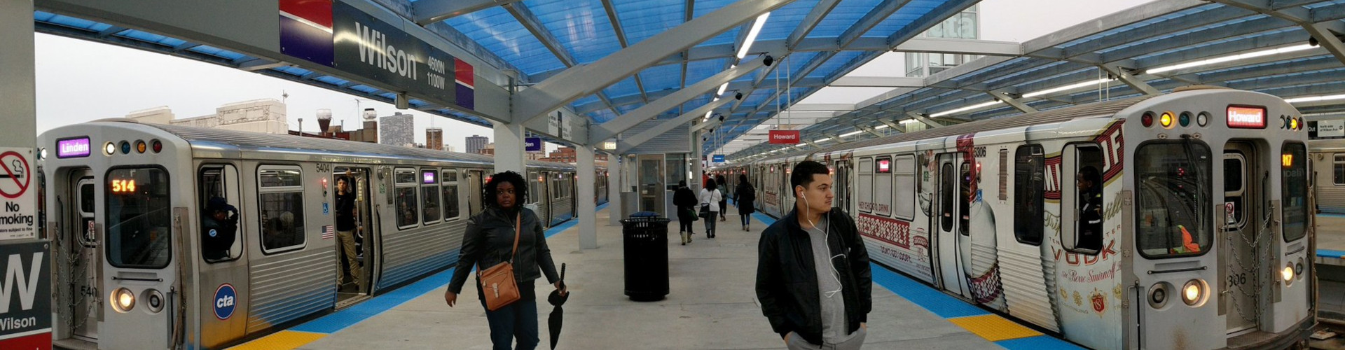
The Transportation Equity Dashboard tracks access to opportunities for residents of seven US cities, visualizing how access by public transit changes over time as transit schedules change. To determine if access to opportunities is equitable in these cities, we track outcomes for people from different neighborhoods and demographic groups, traveling with different constraints and by different modes of transport.
To create transit systems that work for everyone, transit agencies and advocates must first understand how well people of varying identities can or can't access what they need to thrive. This dashboard establishes where and how to amend transportation policies and investments to eliminate disparities in access. Advocates can use this information to demand change from transportation decision-makers, and transit decision-makers can apply our data to implement solutions within their systems.
Note: The dashboard does not measure every aspect of transportation equity — for example, safety on public transit for different groups of people or access to opportunities for someone using a mobility device. TransitCenter research examines these and other elements of transportation equity.